The problem with creating a company specifically to please enthusiasts is that you will inevitably disappoint your fanbase. Whether it’s by chasing profits by building more mainstream products, or by embracing greater commonality to please your shareholders, there will come a point where you will do something that seems like a betrayal – and get your fans royally pissed off.
OnePlus is exactly that kind of company. It arrived on the scene in late-2013 and immediately carved out a niche with its “Never Settle” motto, a bonkers invite-only selling strategy and its promise of delivering a near-stock Android experience and lots of customisation options – all at a wallet-friendly price. It was exactly what enthusiasts were looking for and the brand soon found itself with a growing fanbase.
But over time, the company started to lose its enthusiast-first identity – first by gradually increasing the price of its phones to flagship levels, then by creating a series of clearly-compromised cut-price Nord models. But the biggest knife-in-the-back moment was when OnePlus decided to merge OxygenOS 12 with ColorOS 12 last year, in what we could only assume was stablemate Oppo trying to assert its dominance over the company.
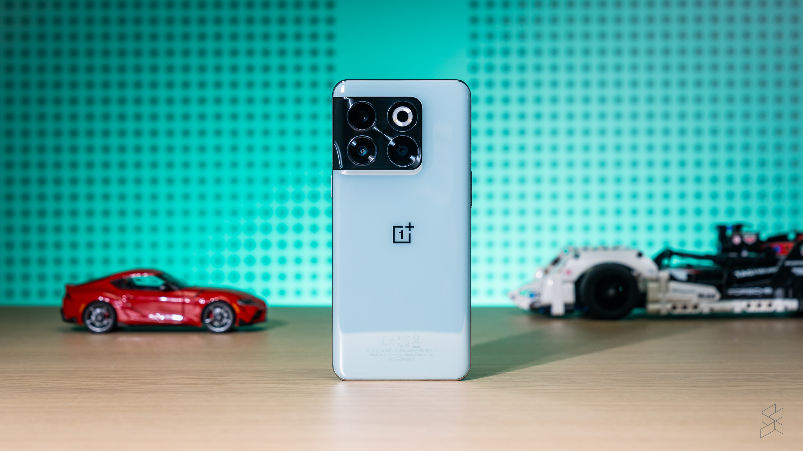
It’s this white-hot crucible of criticism that the OnePlus 10T arrives in. To some, this is probably the most contrived model in the company’s existence – it’s a phone that has ditched a lot of what attracted fans to the brand in the first place. But I’ve spent a lot of time with this phone and while it is far from perfect, there’s also plenty that’s genuinely good about this device. There’s a whole bunch of things to unpack here, so let’s get going.
The elephant in the room
Let me get one thing out of the way first: I am an iPhone user through and through. My past experience with Android (before I got sucked into an iOS addiction back in 2016) was limited to a bunch of budget phones – a god-awful hand-me-down Samsung Galaxy Mini and the still fondly remembered second-generation Moto G. All this is to say I have no past experience with OnePlus and its “flagship killers” that garnered the company such a cult following.
Which is why I’m not especially bothered by the fact that OxygenOS 12 is closer to Oppo’s ColorOS than ever before, or that there are far fewer customisation options this time around, or even that the interface basically skips the whole Material You redesign so integral to Android 12. I did sometimes wish for an alert slider, but that’s only because the mute switch is something I’ve taken for granted with my iPhone.
As always, your mileage may vary. If you come from another Android phone, you could just use this exactly like your old daily driver and wonder what all the fuss is all about. If you’re a hardcore OnePlus fan, on the other hand, the 10T will rankle you no end, though the company’s recent decisions were probably enough to have turned you off already. I will say that because this phone technically isn’t a flagship, the omissions are more excusable here.
On the charge

The deletion of certain features does come with one big benefit. OnePlus’s explanation for nixing the alert slider may seem like a cop out, but if it really is to provide space for the 150W SuperVOOC charging then I’m all for it – because it’s a game changer.
The company says it takes just 19 minutes to get the 10T from one per cent to 100% charge, which tracks with our testing. Starting from a flat battery, the chunky power brick and thick red cable needed 20 minutes and 32 seconds to juice the phone to full. That’s ridiculous, no matter how you slice it.
Not a word of lie: being able to plug up the 10T to make a cup of coffee and come back to basically a day’s worth of charge is something I will never tire. It’s changed the way I’ve used this phone – no longer do I charge it at night because the insanely fast charging would be wasted while I’m in bed catching my Zs. Instead, I wait until the morning to plug it up, get started on work and the next time I look at the screen it’s usually done. I don’t even mind that the 10T doesn’t have wireless charging, because the convenience of the 150W wired system more than makes up for it.
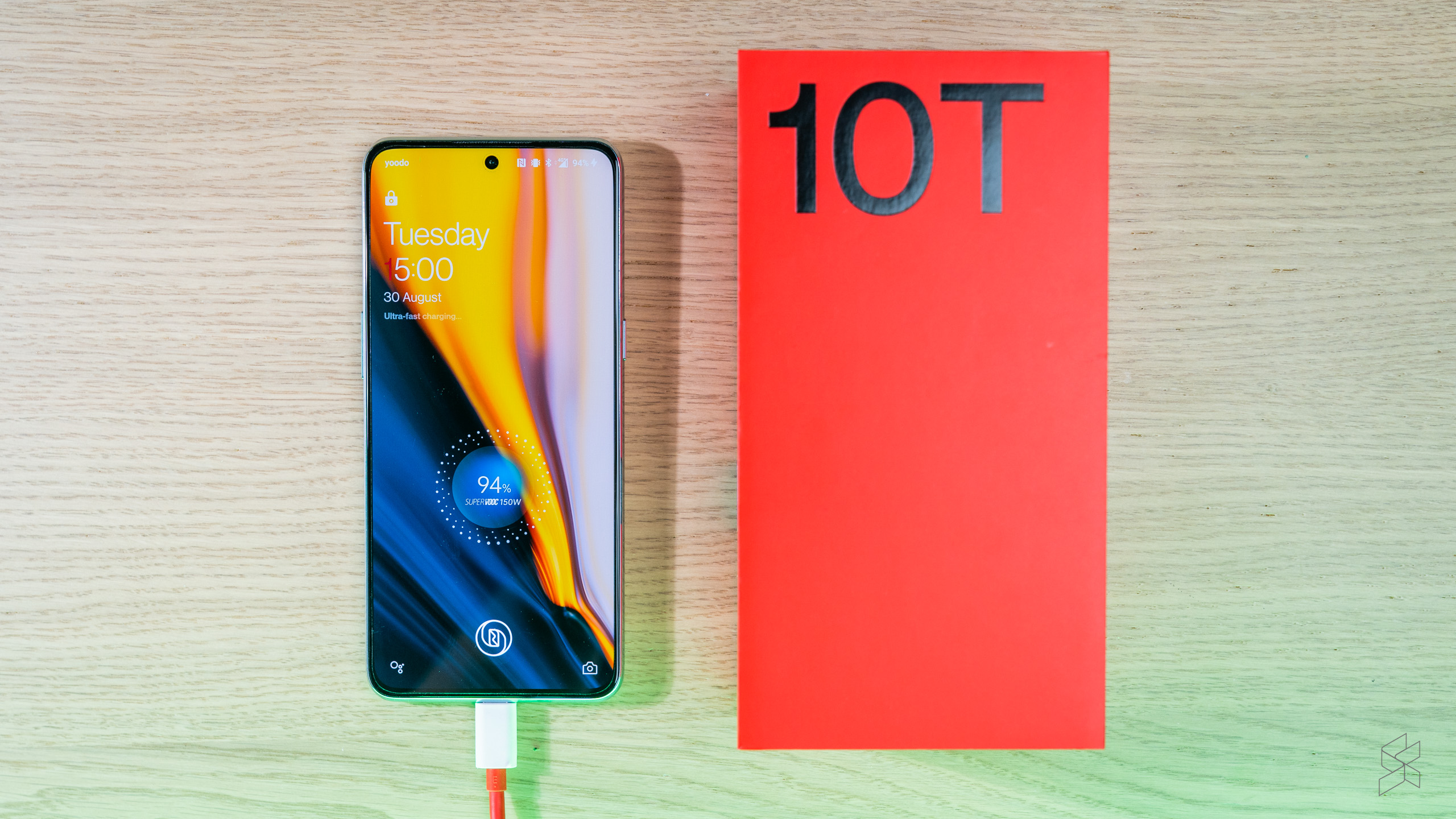
Charging a phone this fast is never good on the battery, so OnePlus has taken some protective steps, most notably by splitting the battery into two. This means each cell receives 75W of power – still plenty but it’s a manageable amount at least. The 10T also constantly monitors the temperature of the battery and will throttle back charging if things get too toasty. The company is even touting a self-repairing function for the electrodes that seems like complete witchcraft; we’ll have to wait and see if the battery can live up to the claim of maintaining at least 80% capacity after four years.
All this does have a knock-on effect. Charging isn’t always lightning fast if you’re actually using the phone, especially when the screen adds its own heat into the mix. The 10T will also switch to “optimised night charging” late in the day, dialling wattage way down when you obviously don’t need it. Don’t worry, 150W charging isn’t some unattainable special mode that can only be seen every third full moon, it’s just that there are times when the battery percentage may not go up as fast as you’d expect.
The desire to fit high-wattage charging also seen total capacity dwindle slightly, from 5,000mAh on the 10 Pro to 4,800mAh. Despite this, the 10T can still keep up with my daily use, which includes the usual Instagram doom scrolling but also plenty of web browsing, YouTube video streaming and Waze navigation; even a short burst of Apex Legends gets thrown in the mix sometimes.
On a particularly busy day the 10T managed to last over 12 hours, including more than five hours of screen on time, before the battery dropped to 20%. Most of the time, you should be able to get a day and a half out of the phone.
Power play
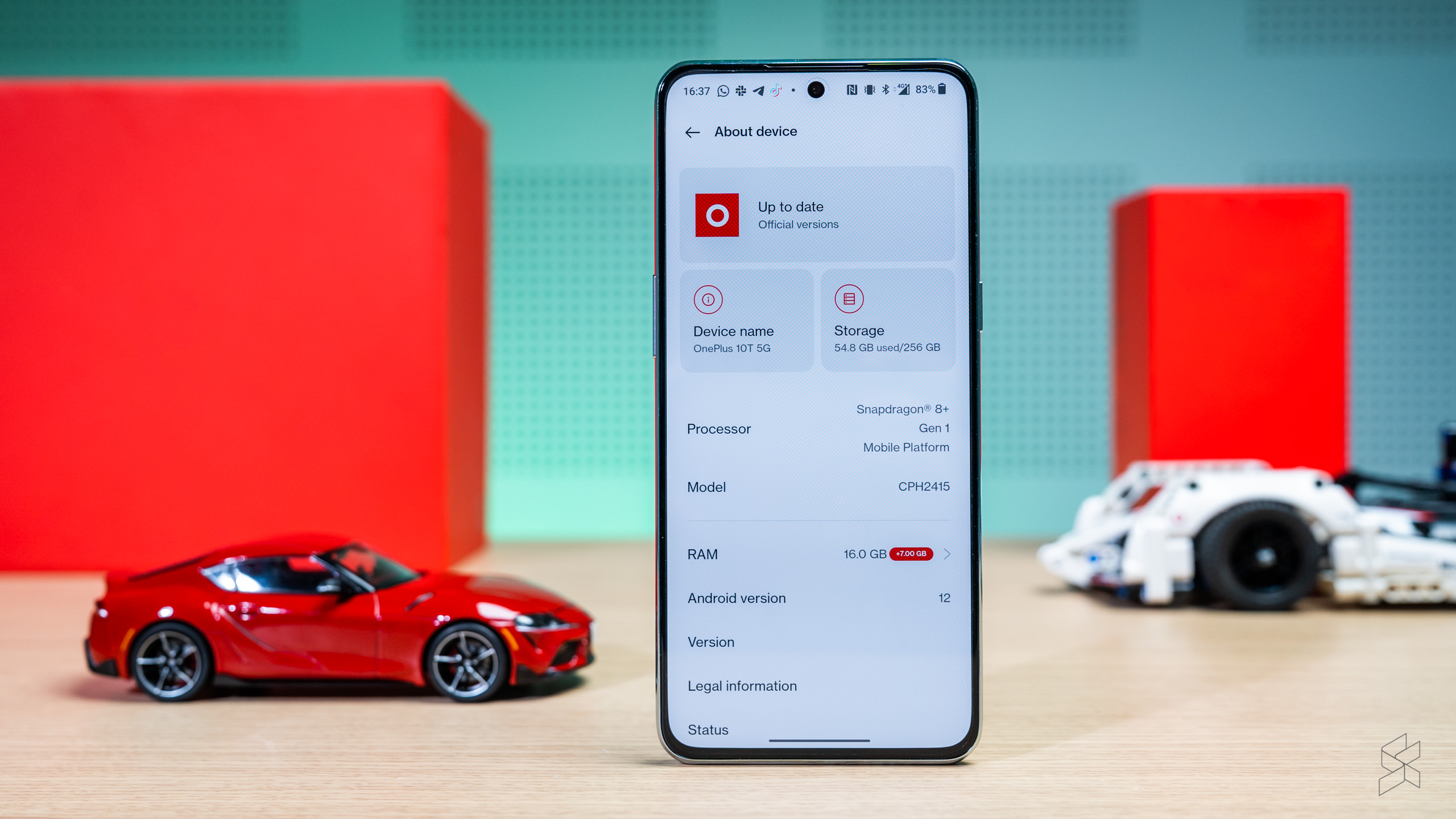
Since OnePlus spent a lot of time talking about the performance of the 10T, we need to focus on it, too. The phone comes with the latest and greatest Qualcomm Snapdragon 8+ Gen 1 processor and, in Malaysia at least, 16GB of LPDDR5 RAM as your only option. Those are some impressive specs and put the OnePlus on par with the Asus ROG Phone 6.
As you can imagine, this phone is fast, even if it doesn’t seem like it in benchmark tests. On Geekbench 5, the 10T scored 1,025 for single-core and 3,222 for multi-core performance, only slightly better than the 10 Pro.


It performed much better with high performance mode turned on, achieving a single-core score of 1,338 (beating even the ROG Phone 6 Pro in X-Mode) and a multi-core score of 3,927. The fact that this feature is buried in the battery settings tells me the phone generally throttles performance significantly to preserve battery life. It also shows how power-hungry the 8+ Gen 1 chip is, even though it’s said to be more efficient than its 8 Gen 1 predecessor.
Thankfully, even when the 10T holds a bit back, there’s still plenty of performance left for daily use. Animations are buttery smooth – especially on the 120Hz display, which we’ll get to later – and you can skip around various apps and use split-screen multitasking without missing a beat. The phone also seems to be able to keep a lot of background apps running instead of closing them – OnePlus claiming the 10T’s Always Alive feature can have up to 35 apps open at the same time.
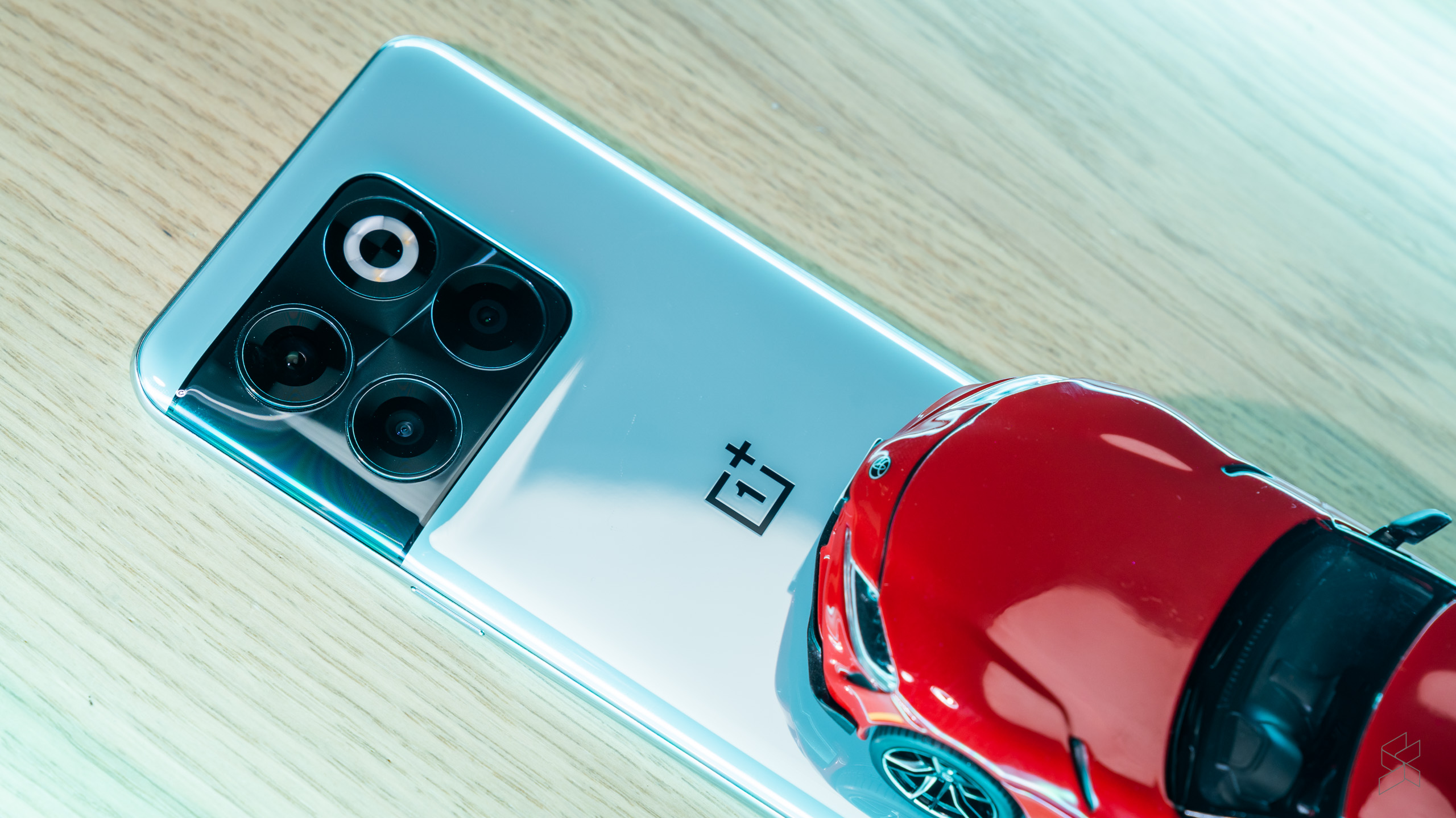
Then there’s the 10T’s gaming performance. OnePlus isn’t positioning this thing as an out-and-out gaming phone, but it has put in some measures to maintain performance when using resource-intensive tasks. Most notable is the cryo-velocity vapour cooling chamber said to be the largest ever fitted to a OnePlus device, with a claimed 50% increase in heat dissipation.
All that talk sound like hot air, but it stands up to real-world use. The 10T performed very well when running Apex Legends – at ExtremeHD settings the phone managed to keep a steady 60fps, with only the occasional stutter. It can get uncomfortably warm during sustained gameplay, but it didn’t seem to affect how it performed; even a monster five-hour run failed to cause a significant difference.
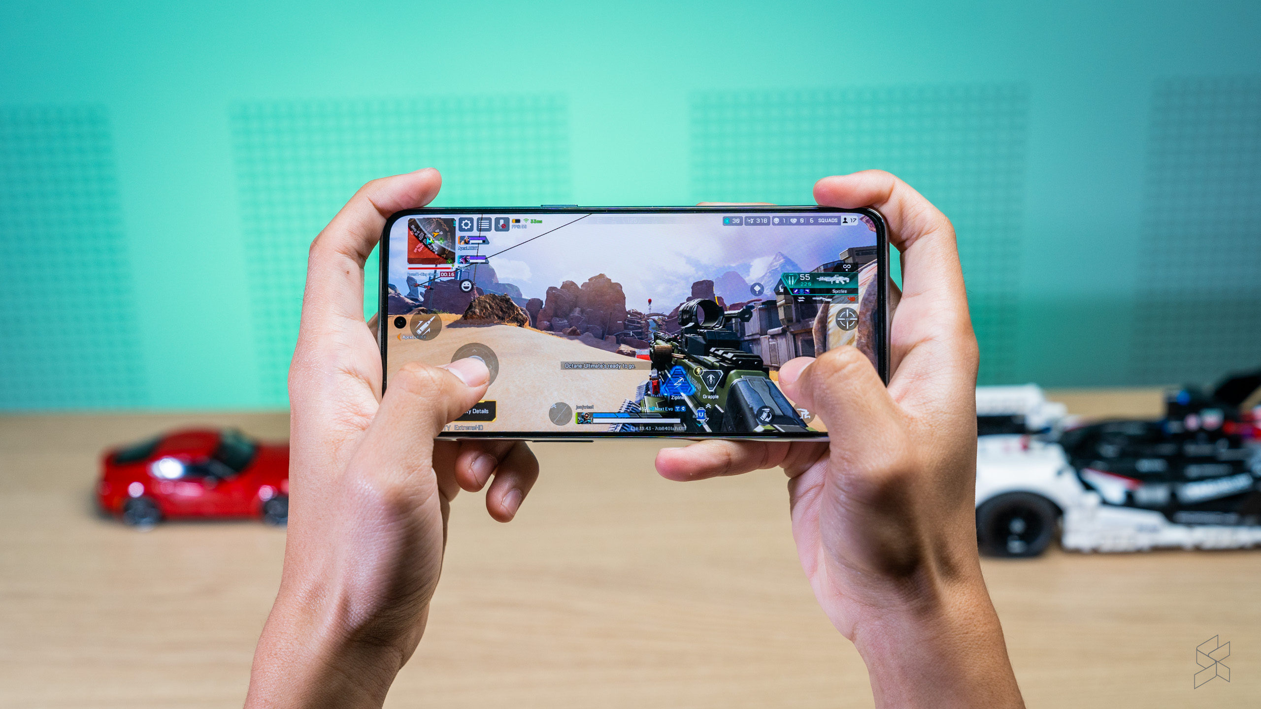
There are downsides to using the 10T as a gaming phone, however. There are no triggers or additional buttons (physical or touch-based) and OnePlus also doesn’t sell a dedicated cooler to keep the device at a more comfortable temperature. But the biggest problem is the hard 60fps cap, even on games like Brawl Stars that can go much higher. That’s disappointing for a phone with a high screen refresh rate and those guts.
Still, if you’re looking for a regular-looking smartphone that you can also use for an occasional round (or three) of your favourite title, rest assured the 10T is more than capable enough to handle anything you throw at it.
So these are the things that have improved over the OnePlus 10 Pro from earlier this year. But the 10T is also not a “Pro” model, and as you can imagine, there are quite a few corners that have been cut to meet the lower price point.
Big screen, small downgrade
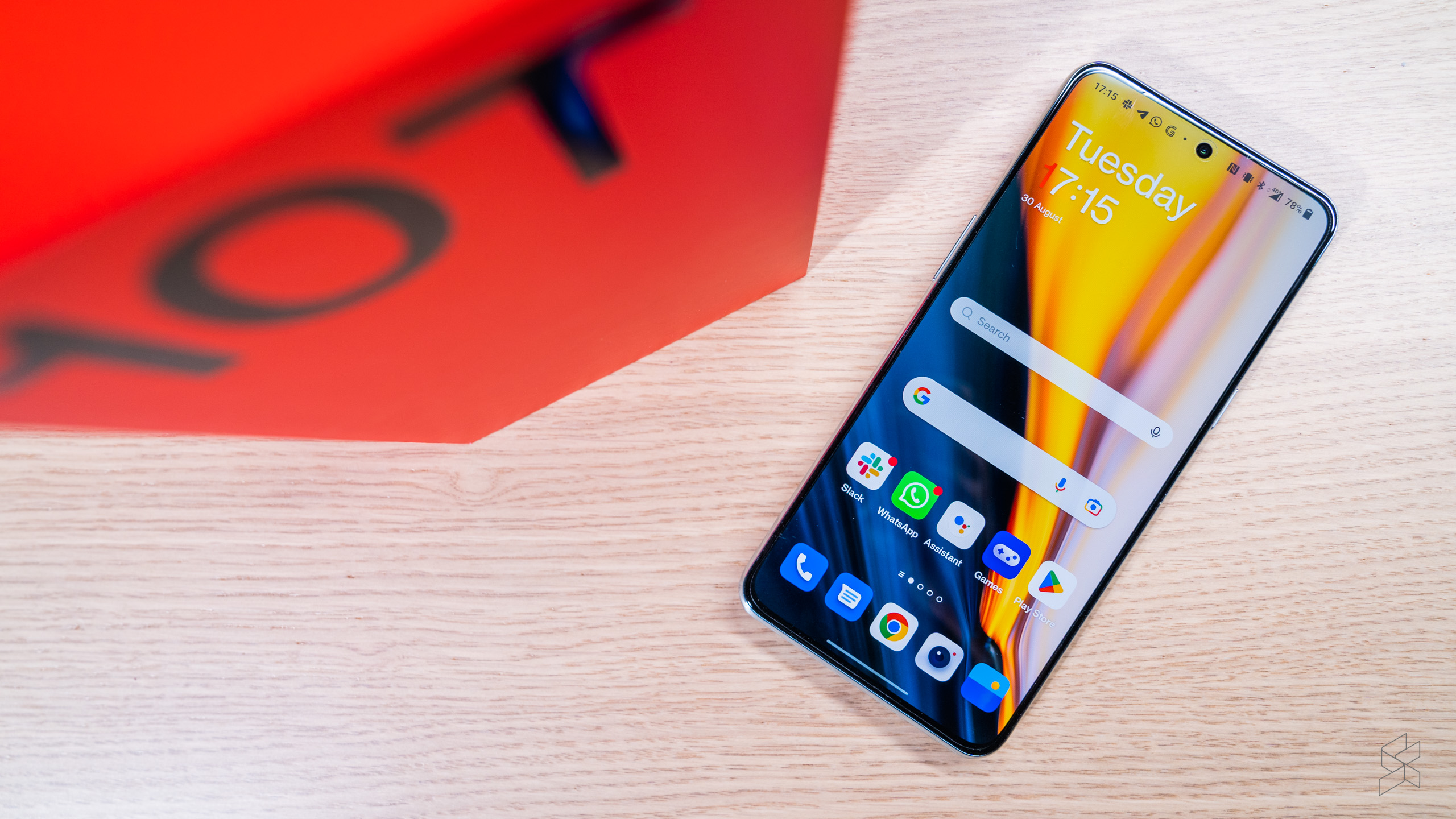
One of these is the screen, but unless you’re a pixel peeper, I doubt you’d notice the difference. The 10T comes with a 6.7-inch AMOLED display that’s as big as the 10 Pro, but it’s flat instead of being curved at the edges. It also has a slightly lower Full HD+ (2412×1080) resolution that results in a pixel density of 394ppi. Okay, so it’s not as high-definition as a proper flagship, but trust me, it’s not something you’ll be bummed about.
Especially since the display still goes up to 120Hz, a dizzying number for someone used to his iPhone 12 Pro‘s measly 60Hz. Where the display diverges the most from the 10 Pro is something you can’t see – it’s no longer an LTPO 2 panel, so the refresh rate only adjusts in 30Hz steps down to 60Hz. This theoretically results in worse battery life since the screen can’t go all the way down to 1Hz, but it’s not like the 10T saps power all that much anyway.
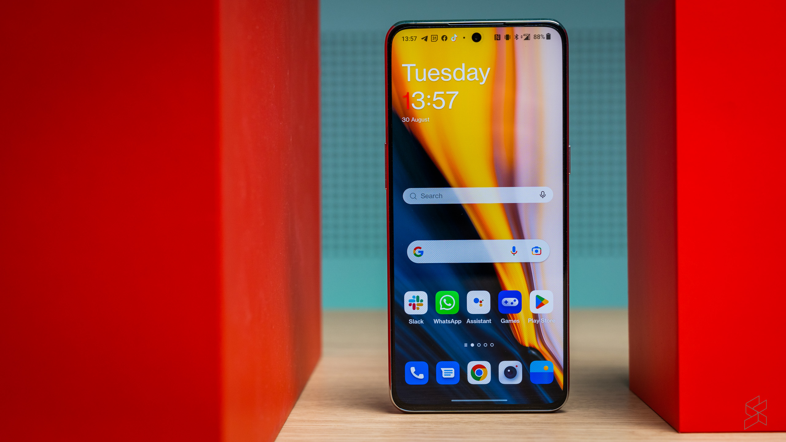
Downgraded it may be, but this is still a great screen with excellent contrast and wide viewing angles. And while peak brightness is only 950 nits versus the 10 Pro’s 1,200nits, it’s still legible under bright sunlight. I have more of a problem with how overly cool and saturated the colours are by default, though the 10T does gives you options to tweak the display to your liking – including a colour temperature slider and a Cinematic mode that uses the P3 colour gamut. It’s nice that you get choices, but on the other hand, shouldn’t a screen be one of the things on a phone that just works?
On the subject on things I don’t quite like, the haptics are strong but lack the precise feel of something like an iPhone, while the auto-rotate function can get a little wonky at times. I do like the sound coming out of the stereo speakers – they can get quite loud (though they sound a little hollow at max volume) and are perfectly serviceable for some light video watching.
No Hasselblad, more gimmicks
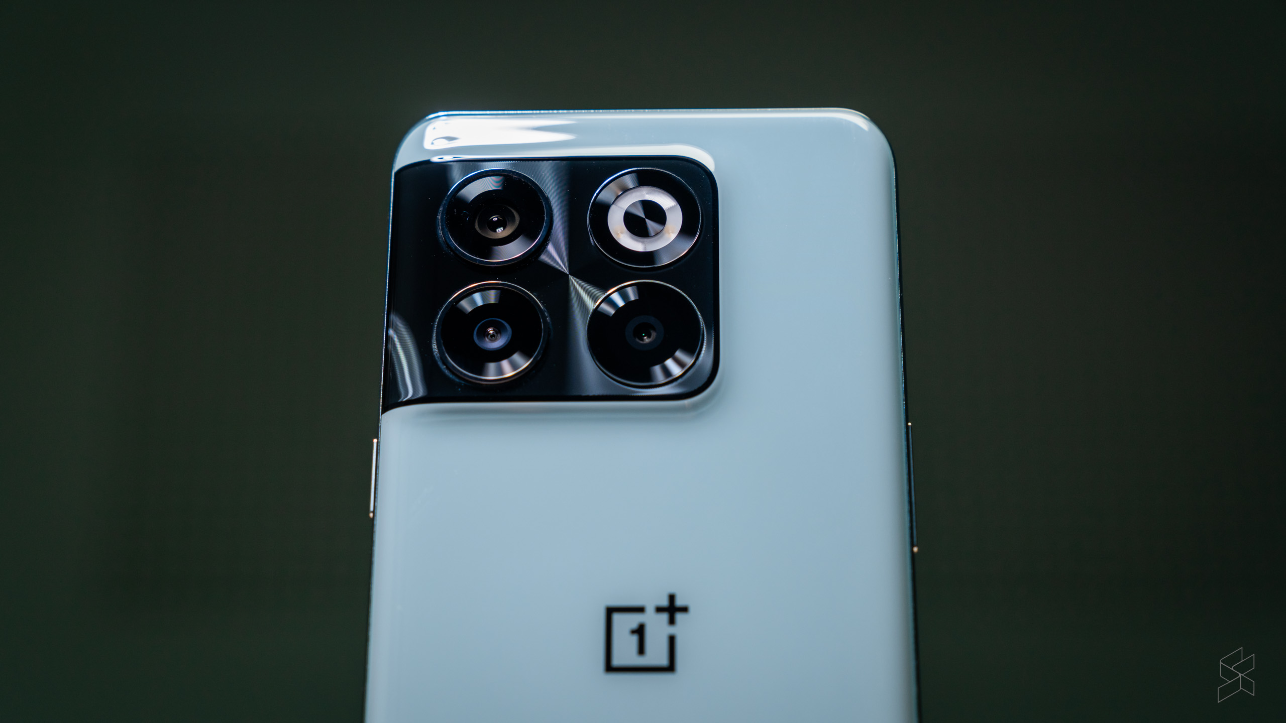
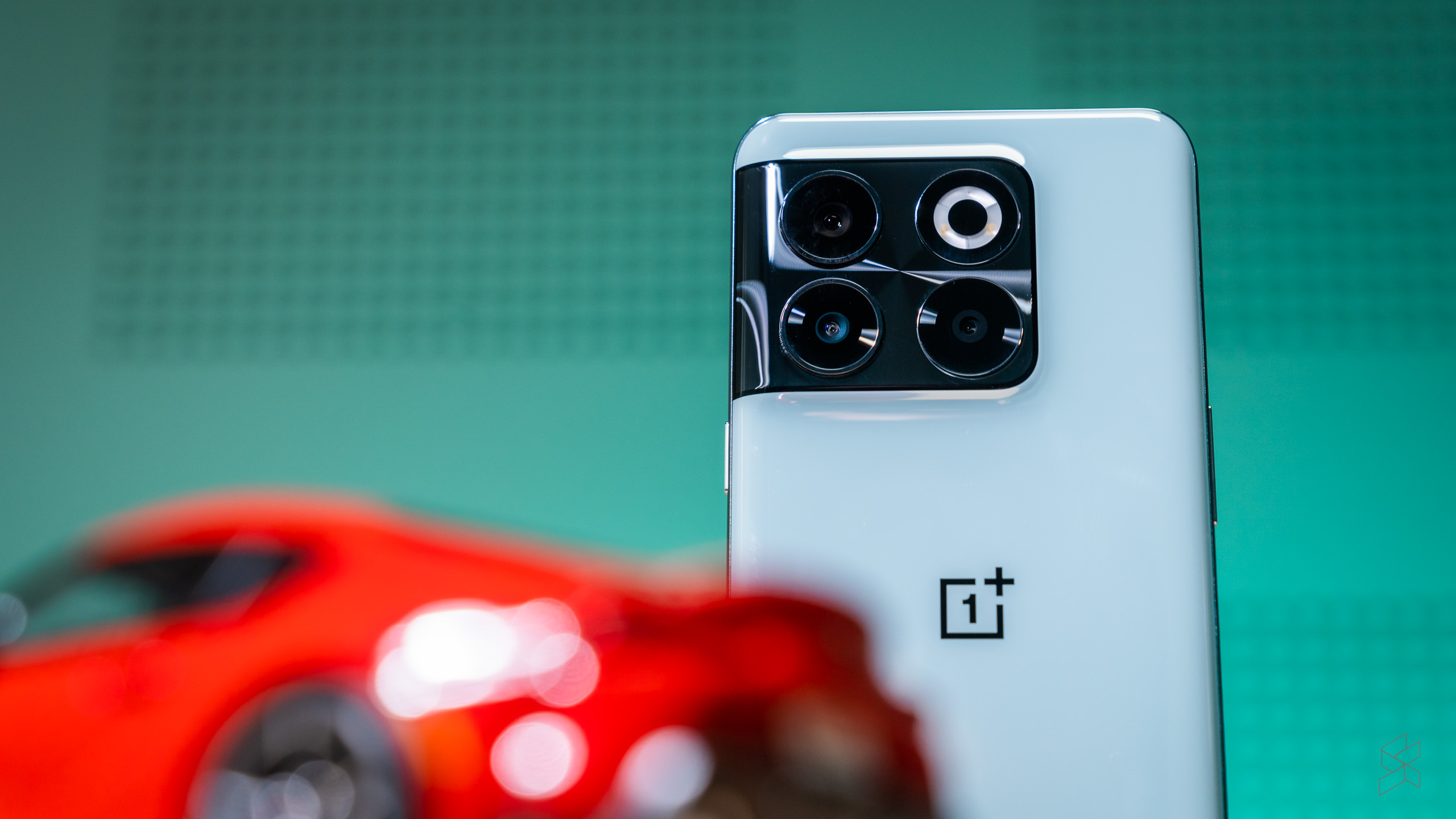
Another area where the 10T loses out is the cameras, which ditch more than the Pro’s Hasselblad branding. The main camera uses Sony’s popular IMX766 sensor shared with a whole horde of upper mid-range phones, including the aforementioned ROG Phone 6 and the Nothing Phone (1). It actually has a higher megapixel count – 50MP versus 48MP – but the slightly smaller 1/1.56-inch size means the pixel pitch is also smaller. The 23.6mm equivalent lens is also a smidge longer, though it gets the same f/1.8 aperture.
Photos from the optically-stabilised main camera are good, with decent sharpness in most lighting conditions; the big aperture also delivers some pleasing bokeh effects. The image processing causes noise to be visible in the shadows, but it’s nothing out of the ordinary. Low-light performance is also respectable, the phone managing to retain plenty of detail, though it nosedives in very dark situations. The 10T takes nice stabilised videos too, if a little choppy.


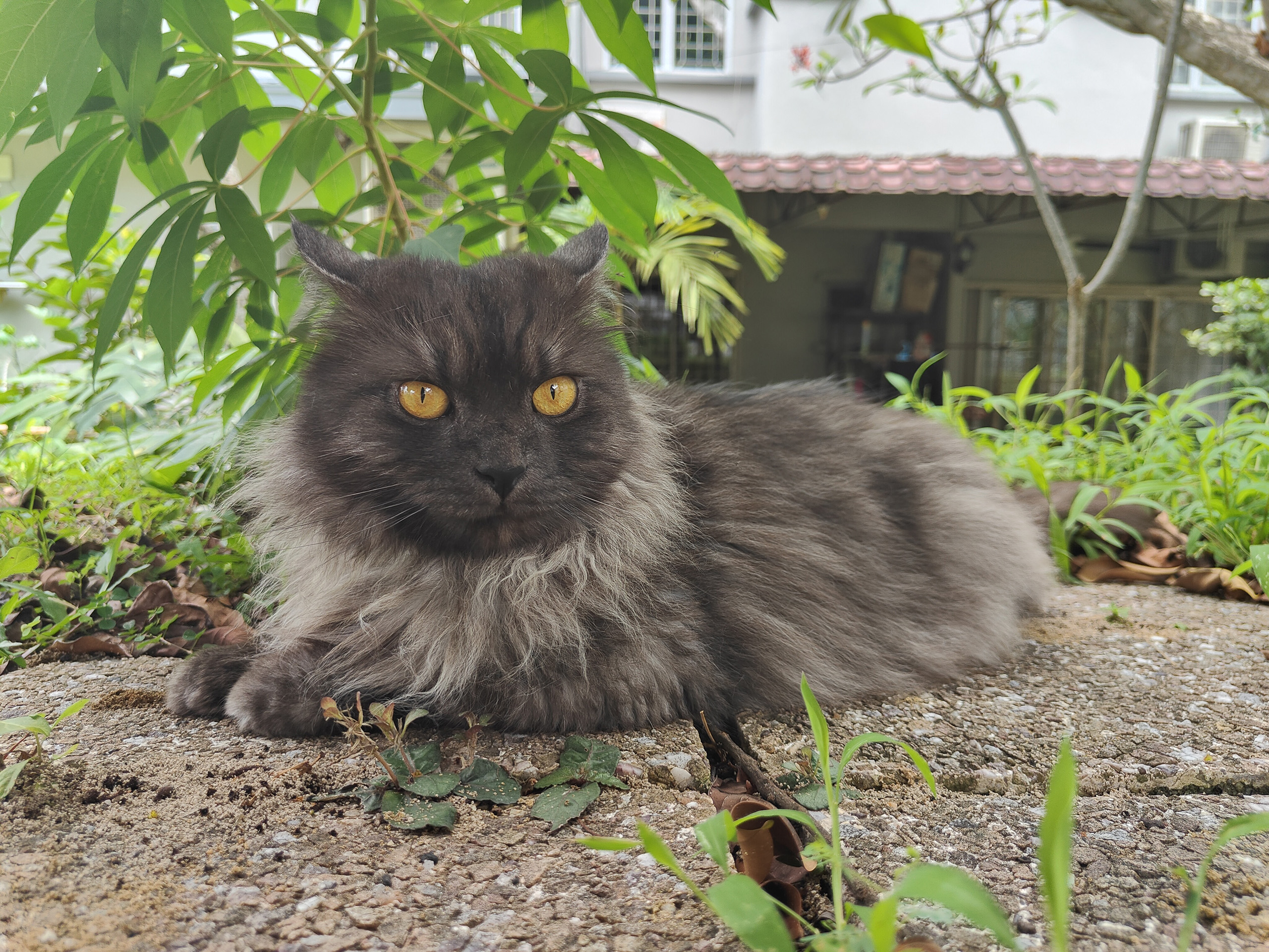


But the 10T lacks Hasselblad’s colour science, and in its absence OnePlus has cranked up contrast and saturation to 11, causing images to look very different from real life. This is actually helpful a lot of the time, as it makes the photos look good without the need to edit them, but in some cases the results can appear quite cartoonish.
There are other instances where the phone is too clever for its own good. The 10T has the tendency to overexpose images, and this gets worse when the AI scene enhancement is turned on. I was trying to shoot a wide shot of an event one time and the phone, thinking that I was getting a group shot, bumped up the exposure and prevented me from dialling it down. Do yourself a favour and turn this feature off.
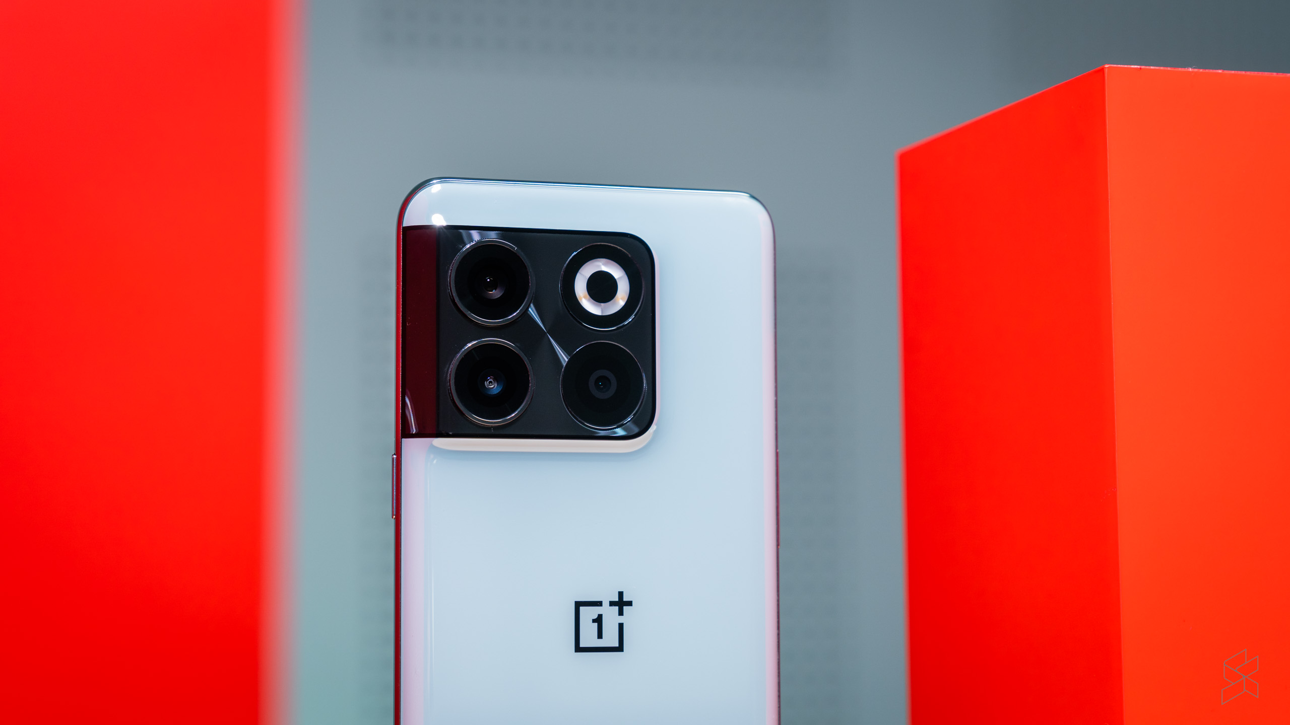
While the main camera gets all the attention, the other cameras have been treated like extras in a B-movie. The ultra-wide has seen its megapixel count dwindle to just 8MP, to the detriment of image quality; photos have a distinct lack of sharpness and exhibit particularly high noise in low light, although they are still just about useable for social media. The 2MP macro camera, on the other hand, is predictably awful – all that detail you gain from getting close is negated when the images look like the lens was smeared with Vaseline. Avoid.
Moving to the front of the phone, the selfie camera has seen its resolution halved to 16MP, but despite this it does a good job in capturing detail, even though it too has wacky saturation at times. All this is to say that the main and selfie cameras are fine for the price, but I do wish OnePlus would rise above the gimmicks employed by other mid-range smartphone manufacturers and stop adding low-quality shooters just to make up the numbers. I’d have rated this phone far higher if it had a better ultra-wide and no macro camera.
It may as well be ColorOS
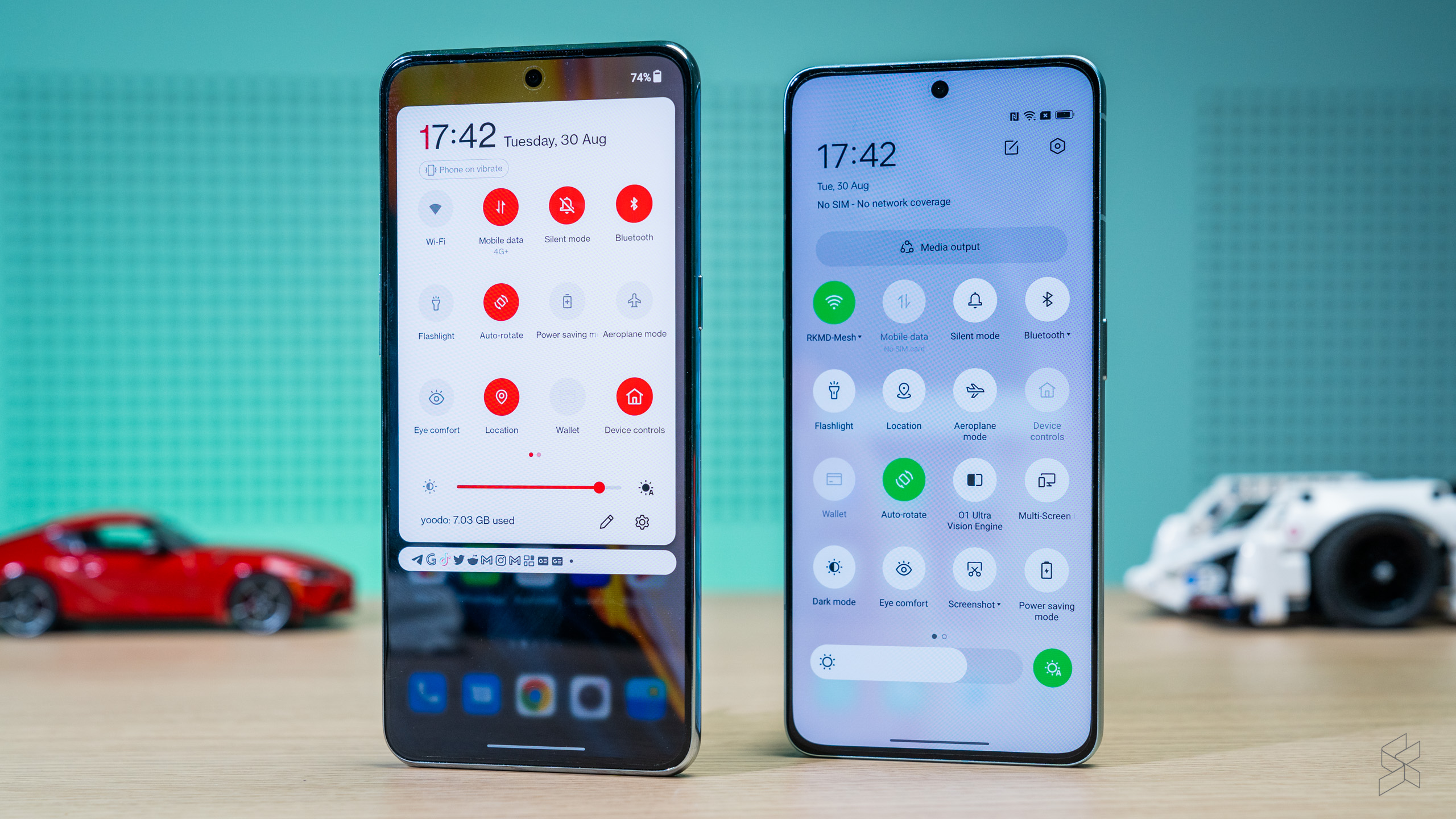
Again, I don’t really care that OxygenOS 12 is ColorOS 12 with some new paint, but it’s still surprising how much the two launchers share. I played around with an Oppo Reno 8 Pro (which, by the way, has the exact same screen as the 10T, but that’s a different story for a different day) and the similarities were uncanny.
The Settings, Camera, My Files and Notes apps and even the Quick Settings pane were all but identical to ColorOS. Even as a casual observer, I was taken aback by how little of its own DNA OxygenOS had left. There are a few unique features, such as the Scout global search function that does a remarkable job of aping iOS’s Spotlight.
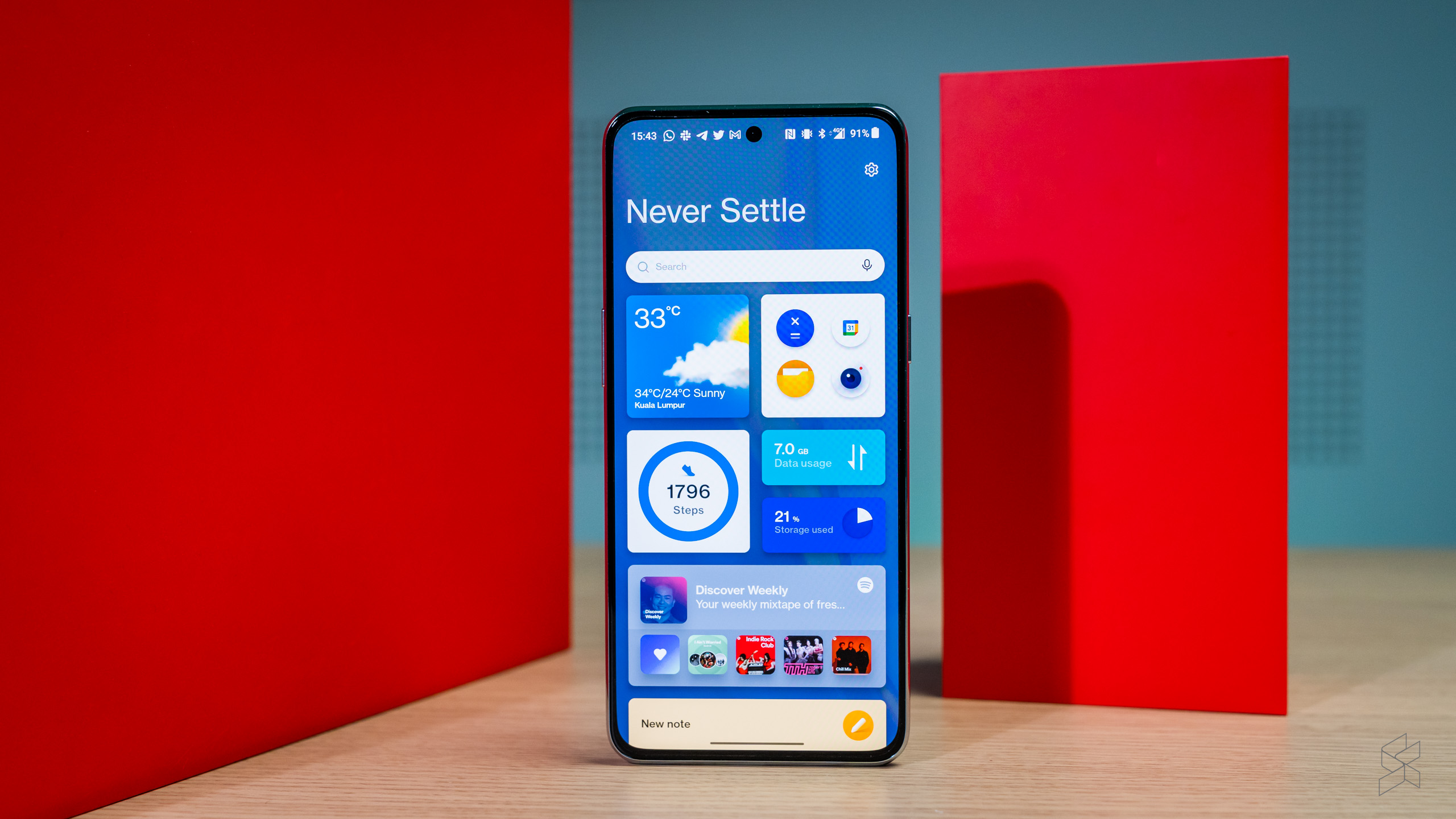
As for the Shelf, it seems quite neat at first, incorporating some useful widgets and the Scout search bar. But I had a few problems in my usage: it’s activated by swiping down on the top right of the display – exactly how I would bring down the Control Centre on iOS. So you can imagine my surprise when I got the Shelf instead of the Quick Settings when I swiped down for the first time. It’s also it’s own app, so dismissing it brings you back to the home screen instead of what you were doing.
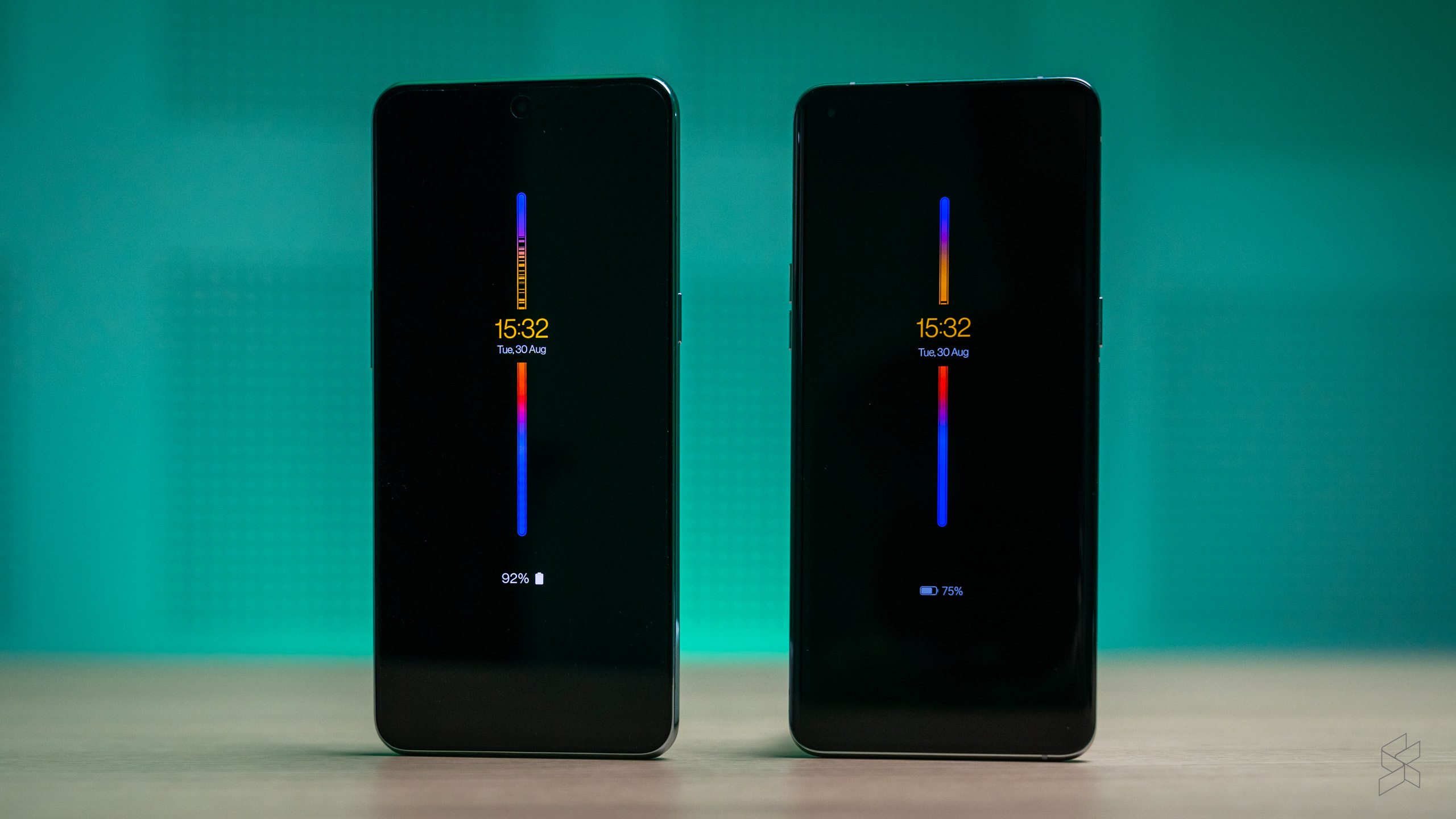
And it looks like even more of OxygenOS’ identity will erode moving forward. There are reports OxygenOS 13 will be even more similar to ColorOS 13, and the latter has even pinched the cool Insight always-on display (which shows you just how much time you spend on your phone) that OnePlus developed with the Parsons School of Design.
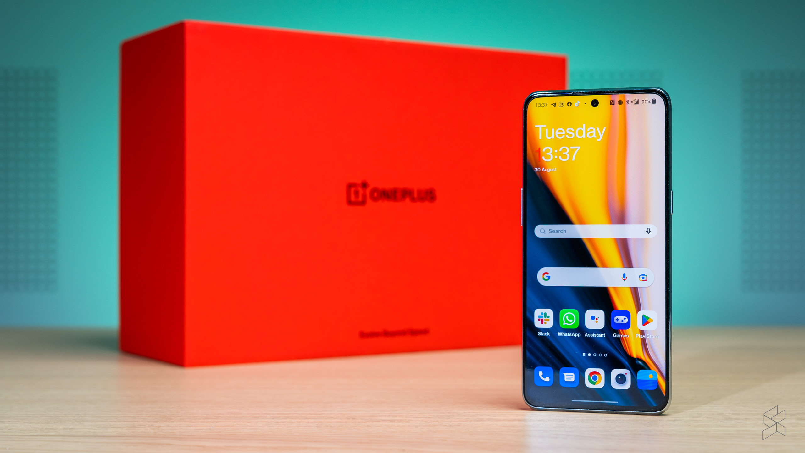
Like I said earlier, none of this will matter if you’re coming from another Android device (and never used an Oppo phone). A bigger problem for you might be the design of the OS. It’s not ugly by any means, but OxygenOS 12 has completely jettisoned Android 12’s Material You redesign, so if you were looking forward to using the colourful new user interface or the big new switches in Quick Settings, you’re out of luck here.
Oppo managed to alleviate the problem by adding a wallpaper colour picker in the settings, but there’s no such customisation feature in OxygenOS 12 – instead, you only get to choose one colour for the icons…and that’s about it.
It’s also a shame that OxygenOS 12 ditched the one-hand-friendly design of its predecessor, as I’m not used to a phone this big. Especially because there are some areas where iOS has started to moved ahead of Android for one-handed use. Apple’s decision to relocate the address bar to the bottom was controversial, but I actually grew to like it and now find Chrome’s top-mounted address bar to be particularly hard to reach.
Aside from all this, the 10T delivers the pleasant Android experience that you’d expect, and OnePlus is also promising three major Android updates and four years of security patches. But don’t give the company too much credit – one of those is Android 13 that came out within a month of the phone’s release; what’s more, it will be launching on the older 10 Pro first, although the 10T should still get it before the end of the year.
And now we come to the elephant in the room.
Wait, there are two elephants?
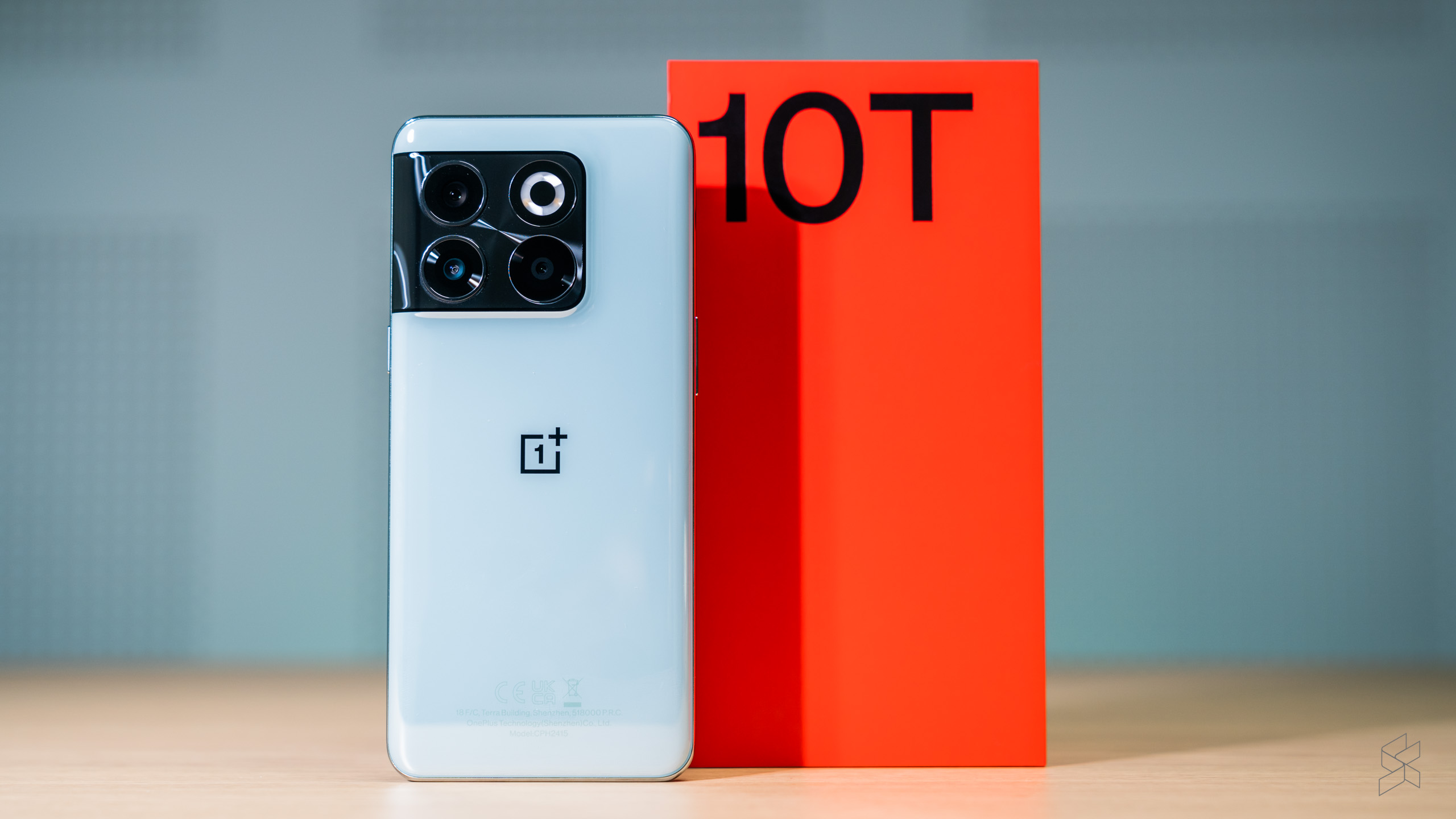
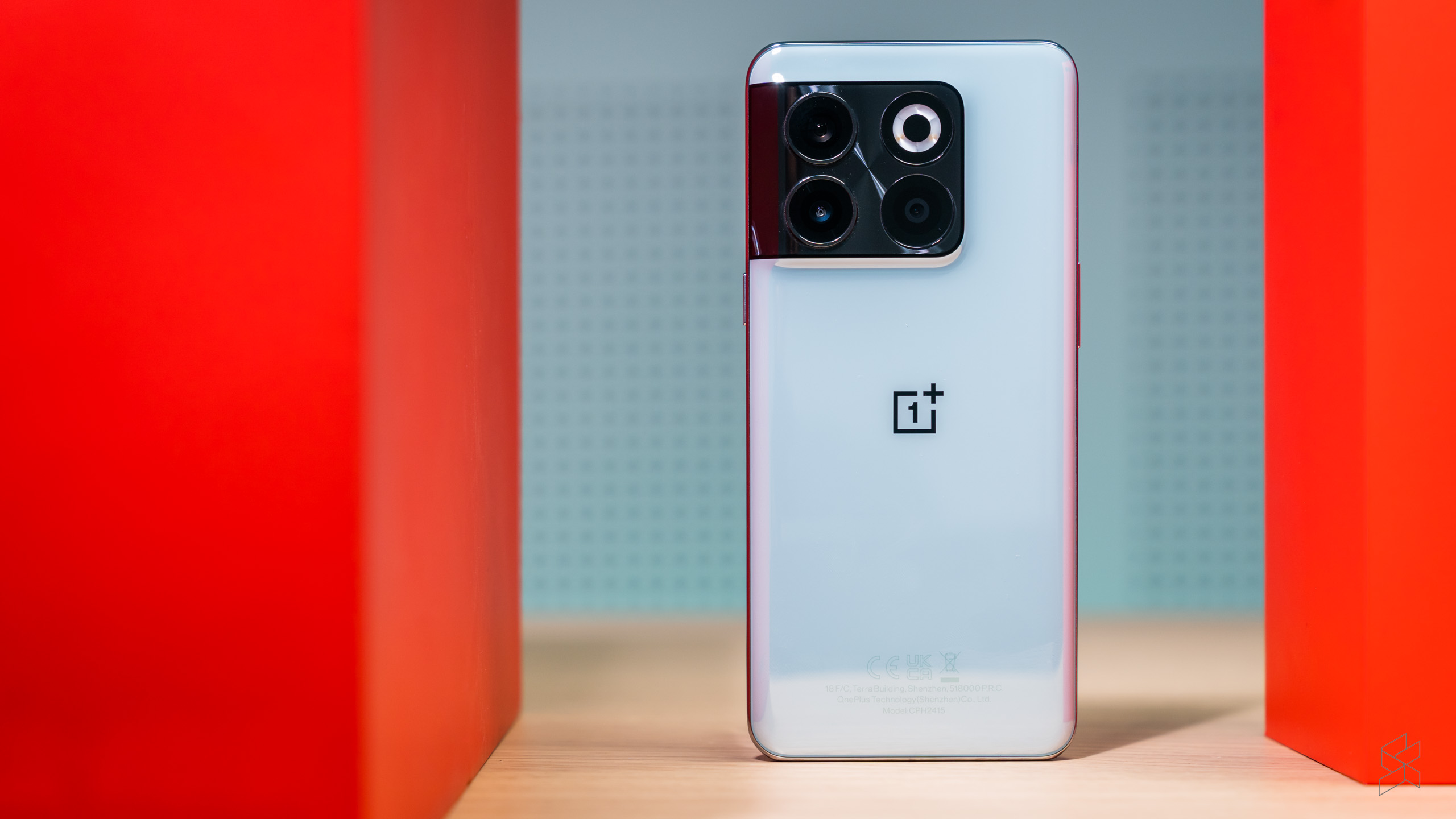
Perhaps the biggest sign the 10T is not a premium flagship is the build. Don’t get me wrong, this is still a hefty phone, as its weight of 203.5g suggests. But there are areas, such as the thin and clicky buttons, that indicate that OnePlus has cheapened out on some of the materials and components. The company also swapped out the 10 Pro’s metal rails for plastic ones, but I don’t mind those so much.
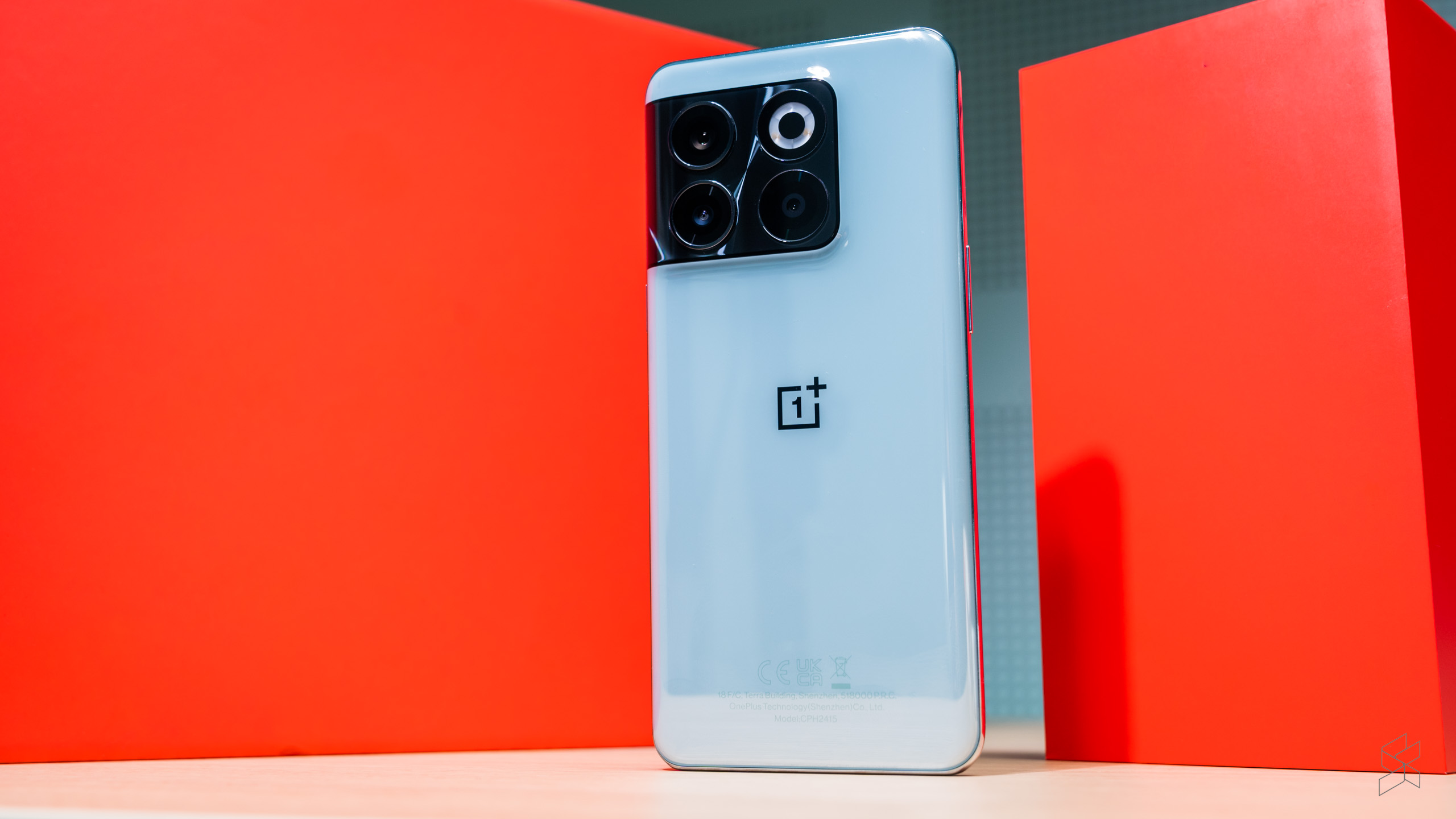
A bigger problem is the glass on the back, which doesn’t feel all that solid when you tap on it. Despite OnePlus’s assurances that the Jade Green model is “fingerprint resistant”, the back of our unit also attracted more fingerprints than any phone I’ve ever seen, made even more visible by the (admittedly attractive) pearlescent finish. The glass itself has also been downgraded to Gorilla Glass 5, two generations behind the latest Gorilla Glass Victus found on the 10 Pro.
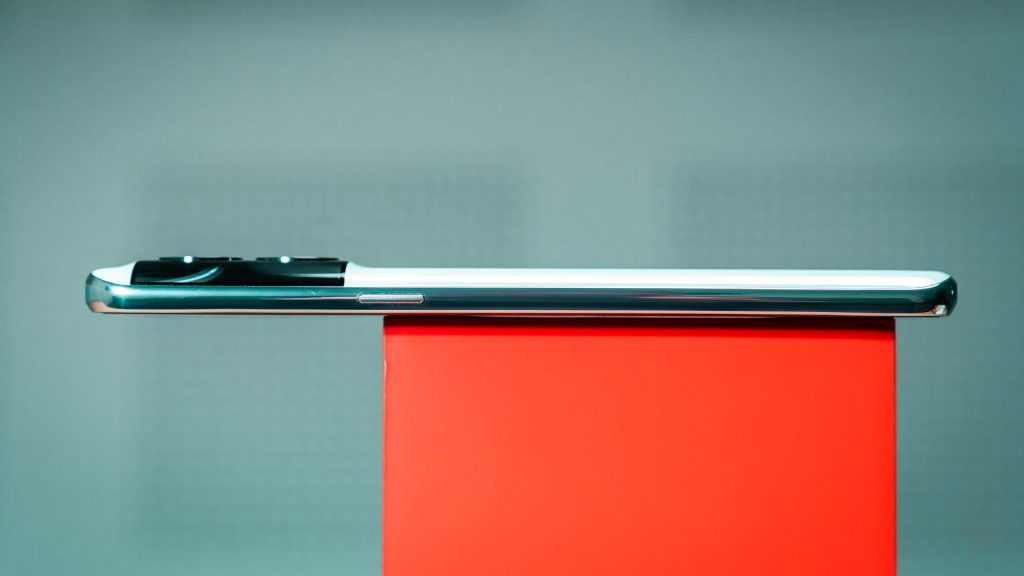
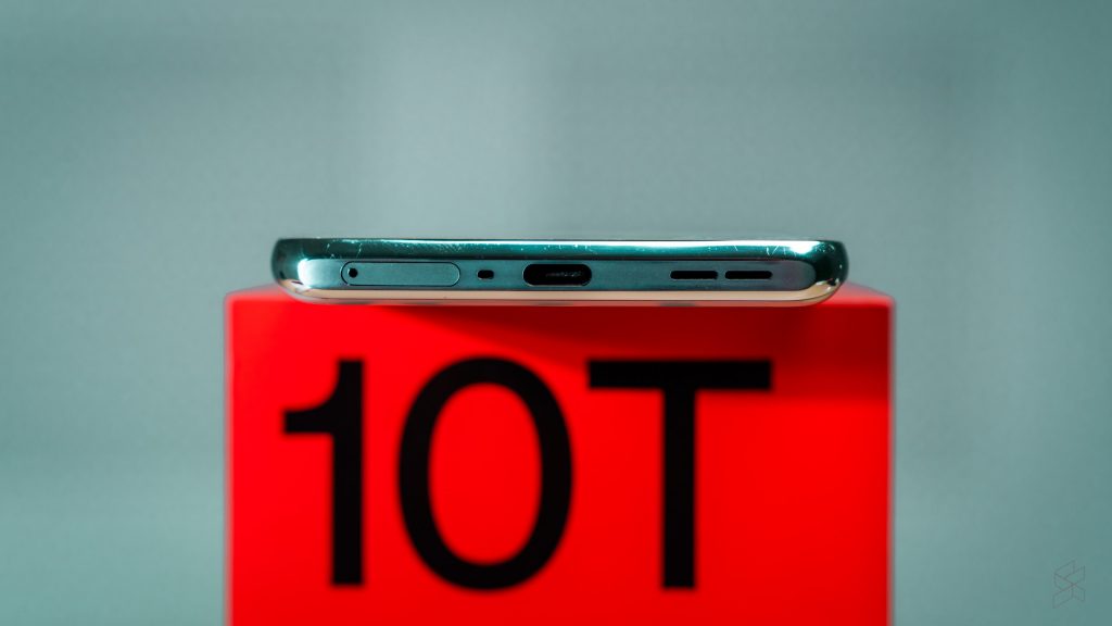
Sure, none of this is any different from what Rory found in his short time with the device, but since then, the 10T has also developed a reputation for being fragile. That’s no thanks to Zack from JerryRigEverything, who filmed himself literally snapping the phone in half with his bare hands. To be clear, the 10 Pro suffered from exactly the same fate.
Now, a stress test like this isn’t realistic, of course – nobody’s going around bending RM3,000 worth of smartphone with their hands. And I do believe OnePlus’s claim that it has put the 10T through a barrage of tests to make doubly sure it can withstand everyday use. But a video like this doesn’t inspire confidence, particularly when you consider how much force a phone goes through when you sit on it.
And then I broke one.
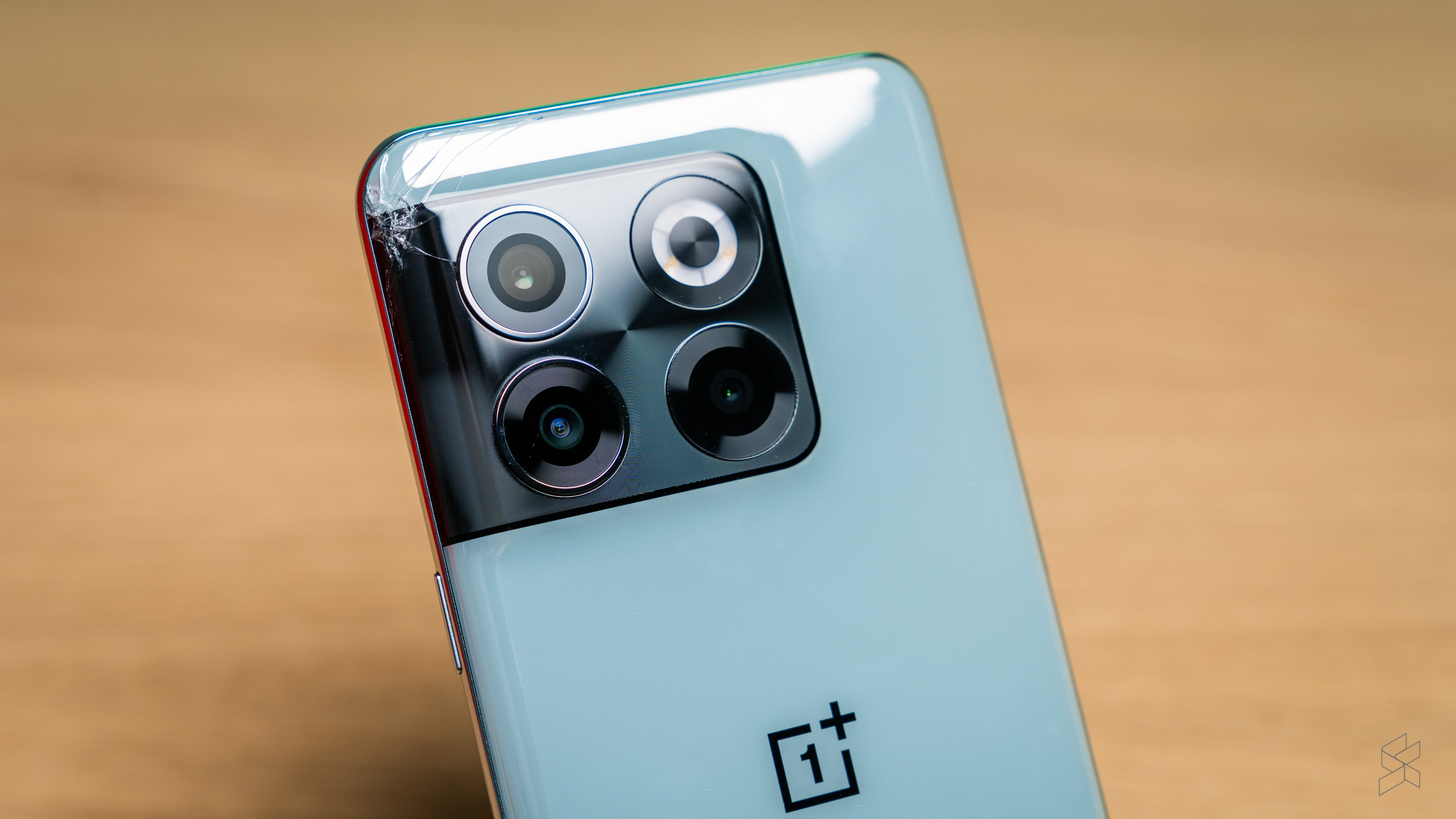
I will put my hand up – this is completely my fault and has nothing to do with OnePlus. I was careless when removing the phone from my pocket and it hit the floor so hard that, deep down in my heart, I knew it was going to be damaged. Sure enough, a spider web pattern now emanates from the top left corner of the rear glass. Thankfully, the company was gracious enough to provide a loaner phone so that we could finish photographing the device.
I must say, it is a little disconcerting that the phone broke while I was using one of OnePlus’s cases – the glacier mat case that’s supposed to keep the phone cool while gaming (neither this nor the black Sandstone case are available in Malaysia). Especially as the crack occurred in an area that was supposed to be protected. My theory is that the case is quite stiff and offers no cushioning, so the shock was completely transferred to the phone.
Look, I know that smartphone damage is random and entirely down to luck. Depending on how it hits the ground, a phone can either come out unscathed or shatter into a million pieces – and no kind of protection a phone or case manufacturer gives can save a device from every sort of fall. I am not blaming OnePlus for this and I’m sure the 10T will last a lifetime with proper care, something I didn’t afford this particular device.
Unfortunately for the company, this episode doesn’t do the 10T’s reputation of being a puteri lilin any favours.
A bargain of a smartphone, if not a great OnePlus
I can understand why the OnePlus 10T has garnered a lot of hate online. It’s not been an easy few months for OnePlus’s PR department, having to explain the compromises the company has made – and then it had to deal with the recent hullabaloo surrounding the phone’s alleged fragility.
But I have zero affiliation with the OnePlus brand and history, and as such said compromises are much easier to swallow. For me, ColorOS…sorry, OxygenOS 12 feels just like any other Android launcher – for better or for worse – and the lack of customisation doesn’t concern someone who’s so used to the iOS’ walled garden in the first place. You also have to realise that OnePlus fans, rabid as they are, are only a small subset of the smartphone-buying market; there’s still plenty of people out there that have not even heard of the brand, and it isn’t fair to castigate a manufacturer for trying to appeal to a wider audience.
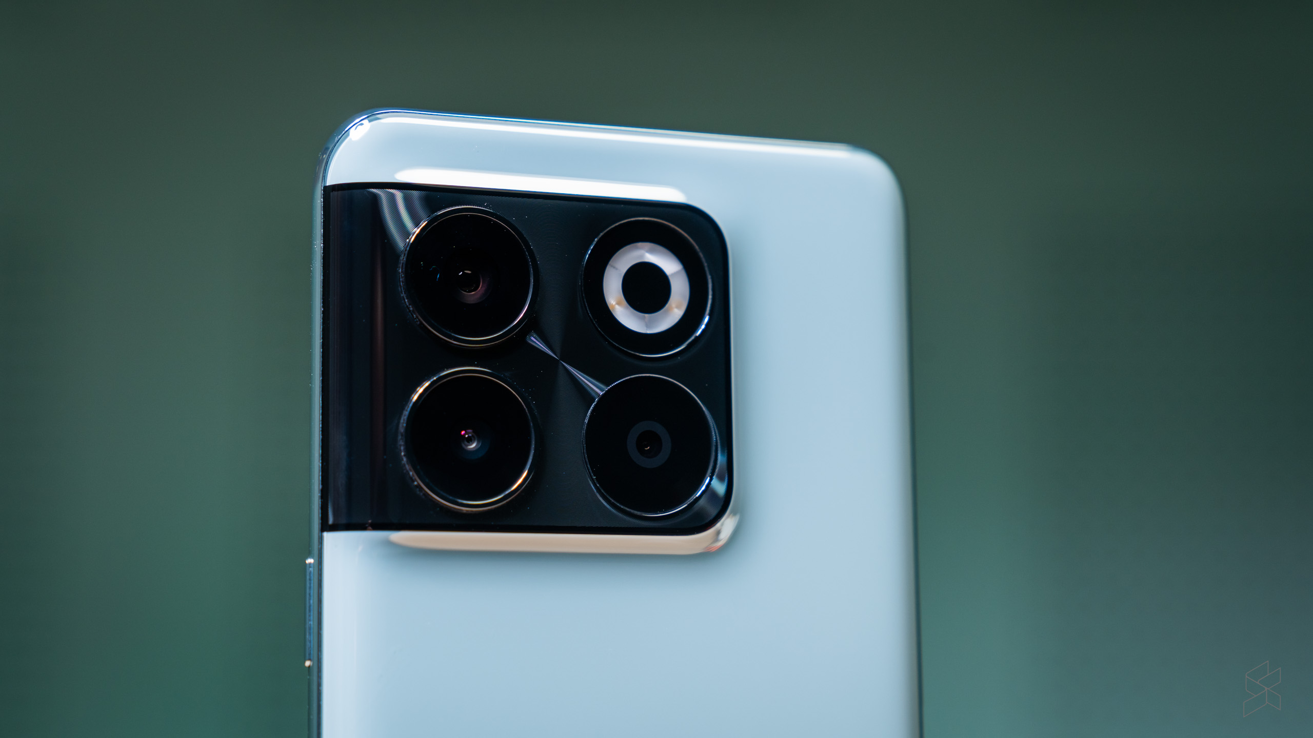
As a casual photographer, I have more of an issue with the cameras. I like taking photos of cars for fun and did miss having a dedicated telephoto shooter as a result. But the biggest problem is the inclusion of a barely-there ultra-wide and a downright useless macro camera instead of a single good ultra-wide. A great phone is measured by its ability to do a few things well instead of everything poorly, and the fact I had to settle for mediocrity runs counter to OnePlus’s core identity.
Even so, the OnePlus 10T has plenty of upsides to make up for this. The amount of performance on tap is addictive, even if you don’t play a lot of games, as it turns using Android (a notorious resource hog, let’s not forget) into a smooth, seamless and enjoyable experience. And I cannot stress enough how much of a killer app the 150W SuperVOOC charging is – it will completely change how you use this phone.
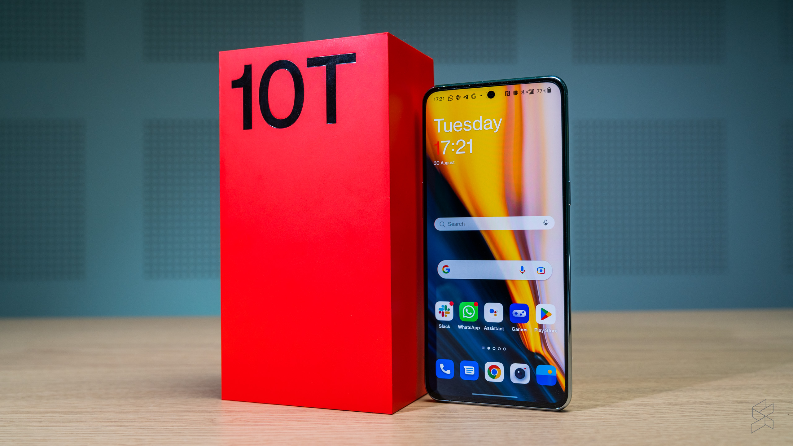
That’s before you get to the price. While it’s a shame OnePlus didn’t manage to sneak the 10T under RM3,000, at RM3,199 with 16GB of RAM and 256GB of storage, this is still the cheapest Snapdragon 8+ Gen 1 smartphone in Malaysia at the time of writing. It’s RM400 cheaper than the base ROG Phone 6, all while offering more RAM – you’d have to spend at least RM1,200 more to get this much performance from the Asus.
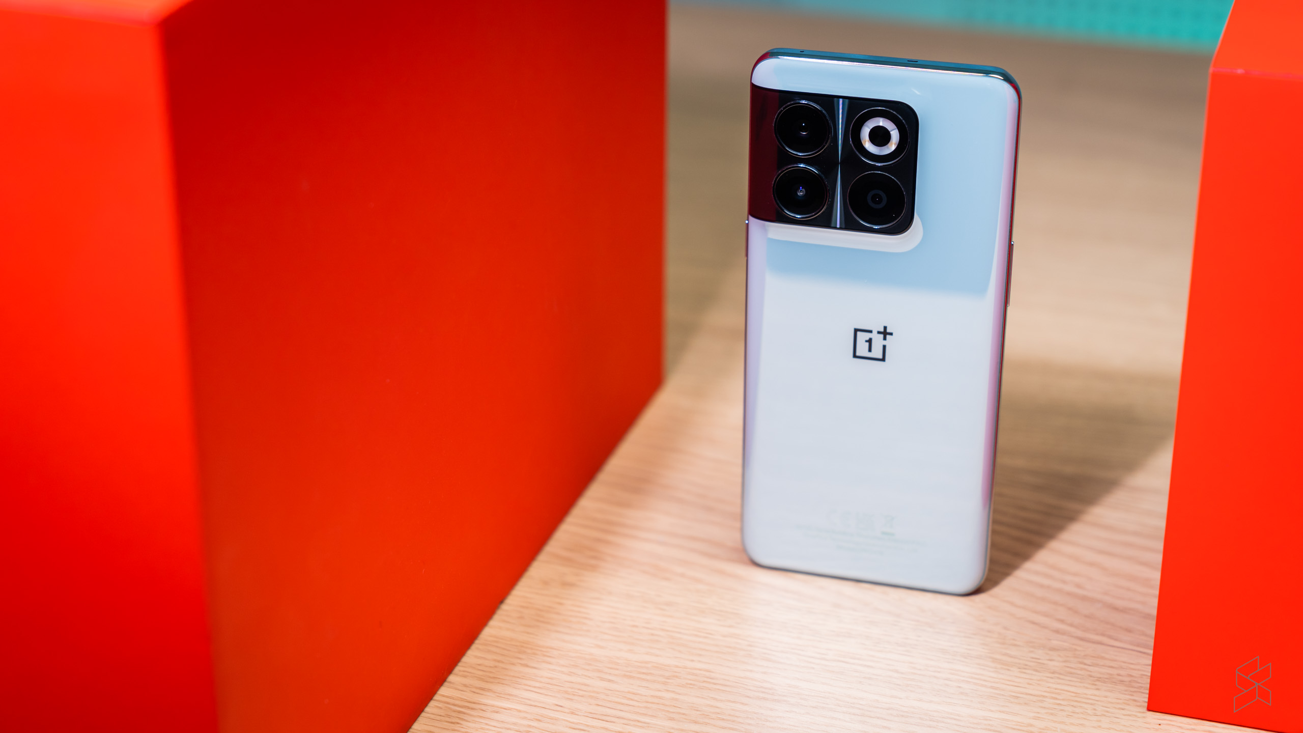
The 10T also doesn’t look like a gaming phone. There are no fancy graphics, RGB lights or chintzy OLED display at the back, just a sleek design and a nice glossy green finish (we don’t get the unique Moonstone Black finish, unfortunately). I would’ve recommended the OnePlus as a ‘stealth’ gaming phone – were it not for the hugely frustrating frame rate cap.
Despite all the flaws (and there are a few), I really did enjoy my time with the 10T. It’s hard not to be swayed by the sheer firepower in my hands, and I also relished coming back to an Android phone after all these years.
Am I glad I’m returning to my iPhone? Is this phone still a letdown for diehard OnePlus fans? Would I recommend using a more protective case with this device? Yes, yes and most definitely yes. But that doesn’t stop the OnePlus 10T from being a bargain.
0 comments :
Post a Comment